
 |
| Responsive menu(hamburger) |
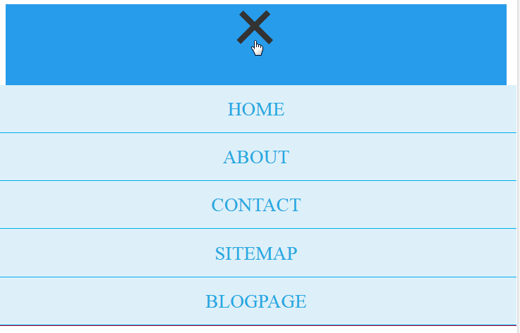 |
| Responsive menu(hamburger) 3 line animated |
Every websites must have a navigation system, and which must be responsive because in mobile browser space is very less than PC. But if you are a blogspot platform blogger than you might face the problem of a responsive menu i.e. navigation.
Most custom templates come with a responsive menu but these are in most themes a takes the form of a simple dropdown menu in mobile devices which looks out dated and not interesting. Today I’m going to post about creating a responsive menu ☰ (animated) withonly some CSS and JavaScript.
Lets have a look:
You have to copy-paste some code snippets into your blog template html code.
To Do This:
1. Go to your Blogger Dashboard, click THEME, create a backup of your template, it is a good practice before going to edit your template code and than Edit HTML,
delete or comment out your previous navigation code.
Now you have to use three types of codes
HTML:
Responsive Menu HTML <nav id=’nav-main’>
<ul>
<li><a href=’YOUR LINK’>HOME</a></li>
<li><a href=’YOUR LINK1′>ABOUT</a></li>
<li><a href=’YOUR LINK2′>CONTACT</a></li>
<li><a href=’YOUR LINK3′>SITEMAP</a></li>
<li><a href=’YOUR LINK4′>BLOGPAGE</a></li>
</ul>
</nav>
<div id=’nav-trigger’>
<span><div class=”container” onclick=”myFunction(this)”>
<div class=”bar1″></div>
<div class=”bar2″></div>
<div class=”bar3″></div>
</div></span>
</div>
<nav id=’nav-mobile’/>
Add this HTML code at the place of your previous menu code or where ever you want.
Responsive menu CSS:
Place this CSS code above }}]]></b:skin> tag (Hit Ctrl+F ) and search for this, paste above this.
Responsive Menu CSS#nav-trigger {
display: none;
text-align: center;
}
#nav-trigger span {
display: block;
background-color: #279CEB;
cursor: pointer;
text-transform: uppercase;
padding: 0 25px;
color: #EEE;
line-height: 67px;
}
nav#nav-mobile {
margin: 0px;
}
nav {
margin-bottom: 30px;
}
#nav-main {
background-color: #279CEB;
margin: 0px;
float: left;
}
#nav-main ul {
list-style-type: none;
margin: 0;
padding: 0;
text-align: center;
}
#nav-main li {
display: inline-block;
float: left;
ont-family: '
Open Sans'
, sans-serif;
}
#nav-main li:last-child {
border-right: none;
}
#nav-main a {
padding: 0 25px;
color: #EEE;
line-height: 67px;
display: block;
}
#nav-main a:hover {
background-color: #3AB0FF;
text-decoration: none;
color: #fff;
}
#nav-mobile {
position: relatifve;
display: none;
}
#nav-mobile ul {
display: none;
list-style-type: none;
position: absolute;
left: 0;
right: 0;
margin-left: auto;
margin-right: auto;
text-align: center;
background-color: #ddf0f9;
z-index: 10;
padding: 0px;
border-bottom: solid 1px #cc0028;
}
nav#nav-mobile li:last-child {
border-bottom: none;
}
nav#nav-mobile ul {
padding: 0;
margin: 0;
}
nav#nav-mobile a {
display: block;
color: #29a7e1;
padding: 10px 0px;
text-decoration: none;
border-bottom: 1px solid #00aeef;
text-align: center;
}
nav#nav-mobile a:hover {
background-color: #111;
color: #fff;
}
nav#nav-mobile li {
display: block;
}
nav#nav-mobile {
display: none;
}@media all and (max-width: 900px) {
#nav-trigger {
display: block;
}
#nav-main {
display: none!important;
}
nav#nav-mobile {
display: block;
}
}
.container {
display: inline-block;
cursor: pointer;
}
.bar1, .bar2, .bar3 {
width: 35px;
height: 5px;
background-color: #333;
margin: 6px 0;
transition: 0.4s;
}
.change .bar1 {
-webkit-transform: rotate(-45deg) translate(-9px, 6px) ;
transform: rotate(-45deg) translate(-9px, 6px) ;
}
.change .bar2 {
opacity: 0;
}
.change .bar3 {
-webkit-transform: rotate(45deg) translate(-8px, -8px) ;
transform: rotate(45deg) translate(-8px, -8px) ;
}
Responsive menu JavaScript:
Paste this code above </head> tag of your template code.
Responsive Menu JavaScript<script type=’text/javascript’>
//<![CDATA[
$(document).ready(function(){
$(“#nav-mobile”).html($(“#nav-main”).html());
$(“#nav-trigger span”).click(function(){
if ($(“nav#nav-mobile ul”).hasClass(“expanded”)) {
$(“nav#nav-mobile ul.expanded”).removeClass(“expanded”).slideUp(250);
$(this).removeClass(“open”);
} else {
$(“nav#nav-mobile ul”).addClass(“expanded”).slideDown(250);
$(this).addClass(“open”);
}
});
});
//]]>
</script>
<script type=”text/JavaScript”>
function myFunction(x) {
x.classList.toggle(“change”);
}
</script>
Adapt this widget according to your requirement:
1. Replace YOUR LINK YOUR LINK1 YOUR LINK2 YOUR LINK3 YOUR LINK4… with your own links and link text, add or delete links as you like.
2. If you want to customize more than change relevant CSS codes.
3. If this widget not worked in your theme than check that this code is present or not in your template html:
<script src=’https://ajax.googleapis.com/ajax/libs/jquery/1.5.1/jquery.min.js’ type=’text/javascript’></script>
If you dont found this code than copy and paste above head above menu JavaScirpt. Now You are done.
Share please if you like this post.